Quality, technology
driven solutions,
delivered on time
High-tech solutions
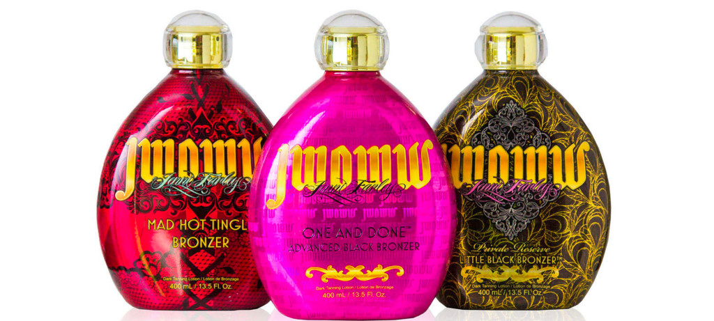
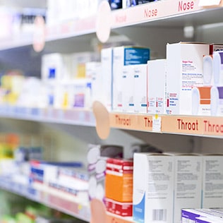
A business partner to technology companies for over 70 years, Cellotape’s focus has been laser sharp since the beginning: to be the best, most trusted source of innovative labels, overlay panels, nameplates, and components to customers in the electronics and medical industries, as well as other companies throughout California’s dynamic economy and beyond.


We’re a part of the resource label group family
When you work with Resource Label Group, you’re gaining an efficient edge over the competition. With locations throughout the U.S. and Canada, we provide the capabilities and reach you’d expect from a national company, with the dedication and touch of a local partner.


Capabilities
What we do
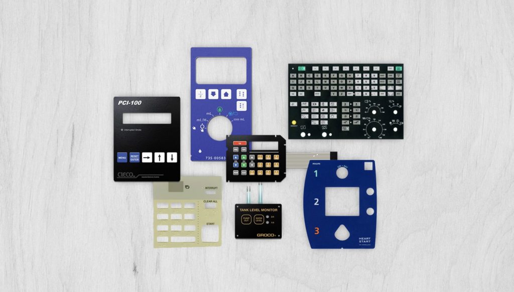
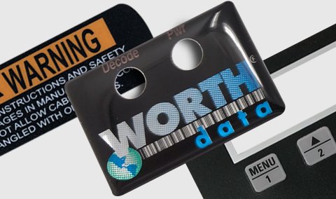
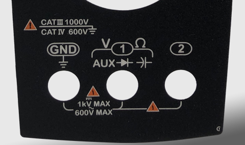
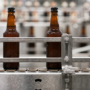
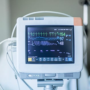
Cellotape manufactures a wide range of custom overlays, labels, membrane switches, and other graphic solutions. Our cutting-edge processes, industry specific capabilities, and quality focus are just some of the reasons many leading companies in the bio medical, instrumentation, networking, telecommunication, semiconductor, and other industries choose us.

Markets
We know the nuances of your industry
Our expert teams offer in-depth insights into market trends and regulations.


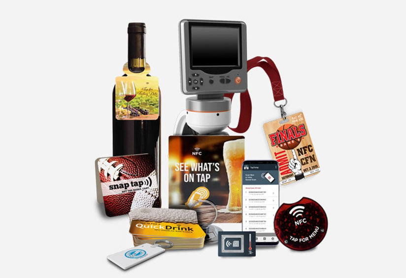
Smart Products
Anything is possible with Smart Products
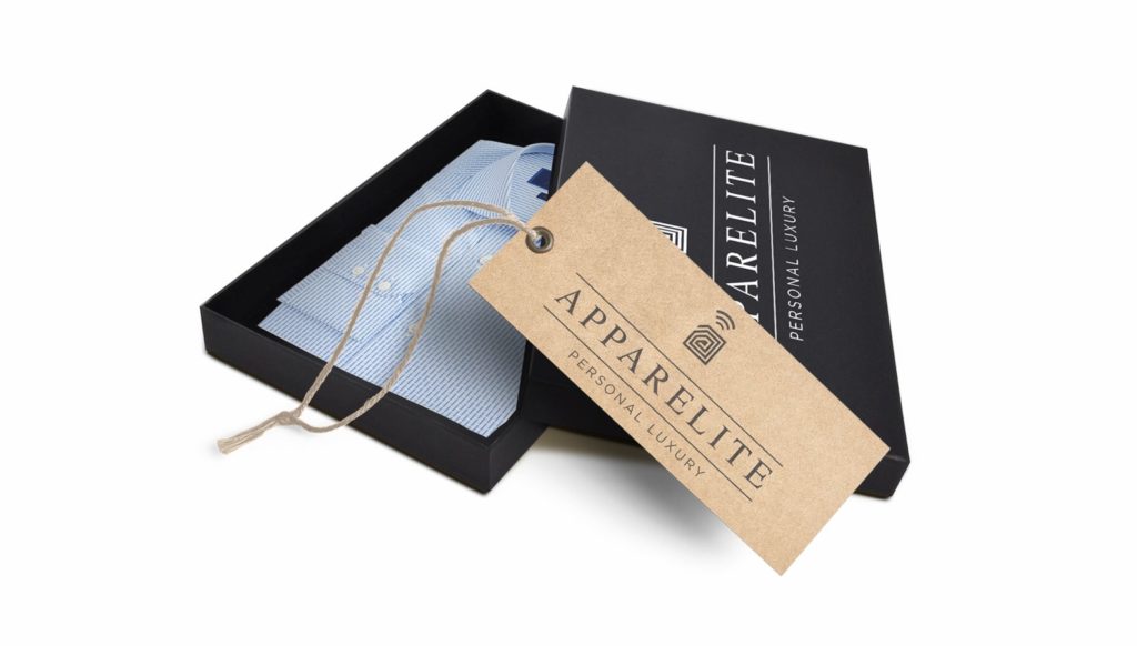
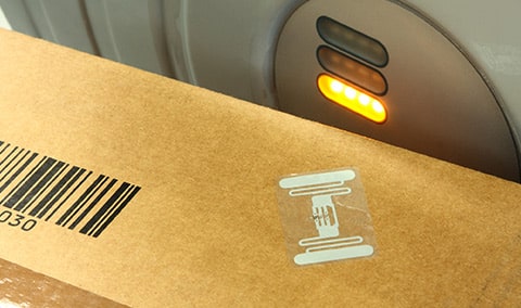
Product Authentication Suite
Near real-time product authentication and “provenance“ using state of the art RF technologies, product and supply chain visibility and security to combat product counterfeiting and the use of non-OEM replacement parts.
Customers get instant assurance that they have an authentic product. In addition to product authentication, our system will enable quick access to cloud based product registration, warranty, sending service reminders and a direct 1:1 marketing channel. Additional alert and trace functionality can be triggered if product is lost or stolen. Tamper resistant and tamper evident tags ensure the digital connection.
Smart Spaces
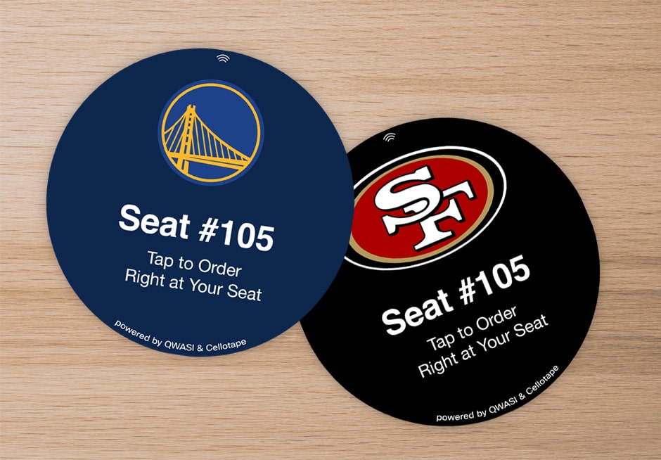
Smart sensors and Smart labels are used to collect data, provide access, enabling quick and easy access to critical information.
Permanent and temporary NFC touch points are designed for applications such as temperature and humidity monitoring, and information availability.
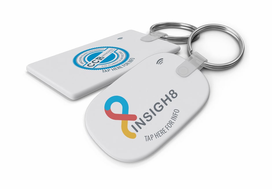
Wearable Technologies
NFC/RFID enabled wearable devices are ideal for identification, proof of presence, access control, and environmental monitoring applications.
Cellotape Smart sensors and tattoos, with their compact design and mobile features, are a natural fit for adding RFID/NFC capabilities to transactions such as easy check in at events, access control, marketing, making payments, and social sharing.
Item Level Tracking and Compliance
Visibility across your supply chain, and in your own manufacturing facilities using turn-key RFID and NFC hardware systems and platforms.
Products include: Smart labels, Thermo transfer labels, Extreme environment tags and enclosures, On metal tags and enclosures, Retail hang tags and On fabric washable tags.
Marketing & Events
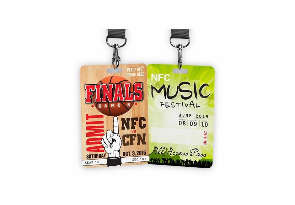
Turbo charge marketing efforts with NFC technology to engage with and deliver richer, interactive experiences to customers.
The digital connection between the consumer, product, and brand expands the reach and frequency of the marketing message, providing relevant and real-time data. Deliver your marketing content in “Context”; the right message, at the right time, at the right place, customized for your audience. Messages can be tailored to a specific time, date, location, current weather, user default language settings, known user or unknown user and their preferences, and prior mobile engagements. Cellotape Smart Products offers a turn-key solution to fit all of your marketing needs.
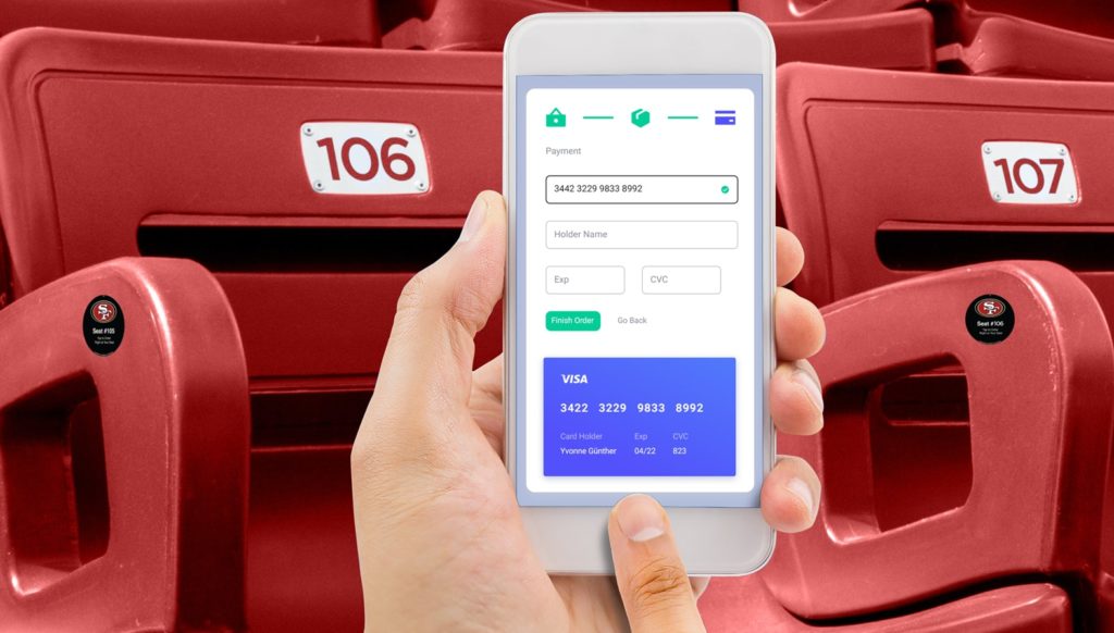
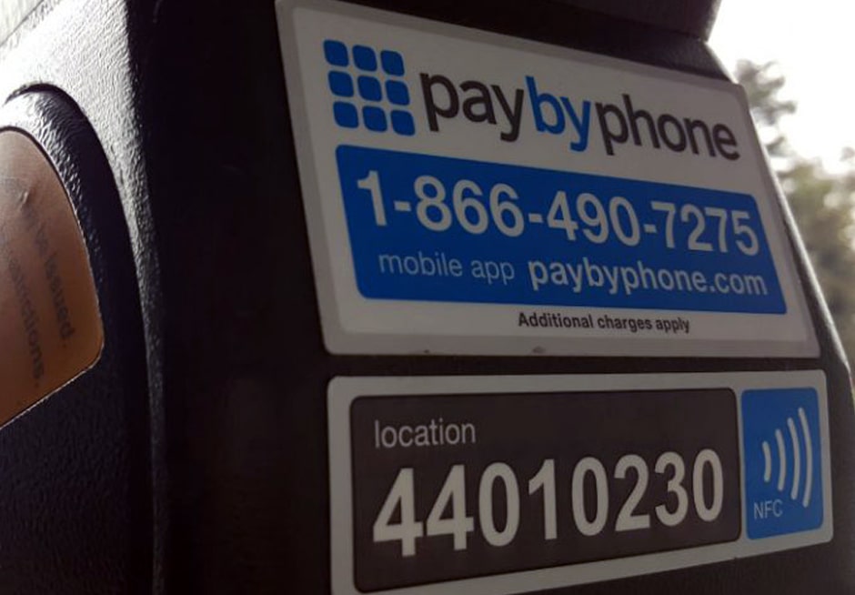
Industrial Compliance
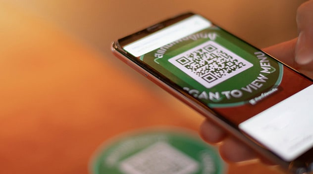
RF touch points provide easy and convenient access to business critical information such as manuals, product registration, access control, smart temperature sensors and loggers, warranty and repair documents.
Industries with logistics, warehousing, transportation and shipping gain better visibility and accountability across their business operations – contributing to faster revenue growth, more satisfied customers and a healthier bottom line.